In industrial automation, HMI stands for Human Machine Interface. Basically, HMI is a means to display the process going on in a PLC to the user. Through graphical representation, the operator can identify what is going on in the PLC cycle.
Reading actual values, understanding plant layout, and setting the parameters are all basic requirements of an HMI.
If the HMI screens are properly designed, then the automation platform will automatically become easier to operate. If there is an abnormal design of screens like mismatching of colors, random arrangement of elements, improper navigation access, or improper representation of diagnostics, then the operator will get totally confused in operating the plant.
So, it is necessary to design the HMI screens properly. Because an HMI is meant to be designed around the needs and the workflow of an operator, other personnel too will have an interest in the information displayed on an HMI and eventually, they would like to operate the system.
In this post, we will learn some general principles while designing a particular HMI screen.
HMI Screen Design
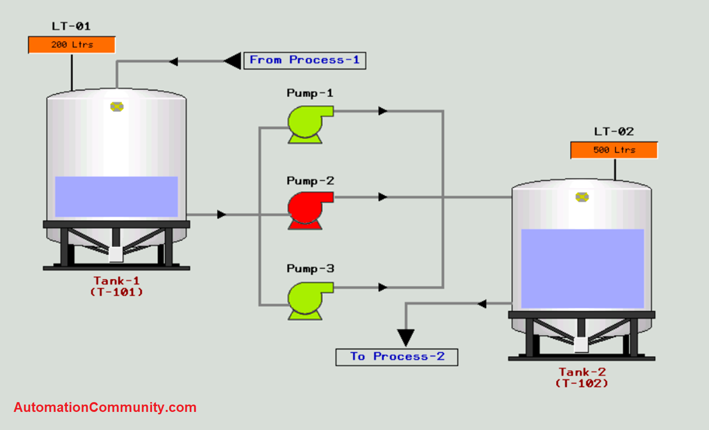
Refer to the above image. The root of HMI screen design lies in good color combination, symbols, aesthetic display, proper lines, proper font size, appropriate font style, arrow animation in P&ID, proper labeling of instruments, settings, and tags, and uniform sizing of components.
Basically, when the user sees screens, he should get interested in operating the system; rather than dumping it and complaining a number of times. Now, in the above image, a standard screen has been set for reference and we will now see what is correct in this.
If you see the image carefully, the following are the points that work for it:
Background Color
Remember that you have a range of colors in the HMI software, similar to a graphic display design. Note that the color should be used to reduce visual fatigue and illusions from long hours of viewing an HMI that uses bright and contrasting colors, which is prevalent in many HMI applications.
When an operator sees the screen and if he is able to view all the components and process them properly, then only he will be able to troubleshoot the system. If dark colors are used, then the view will be very troubling for the eyes.
Light colors always work best, because they give you the best optimal illusion.
Proper Line Size
Lines are a very important tool to represent the connection of the process. If the line size is uniform, the color is uniform, and straight in shape (not tilted or mismatched), then the overall process looks very good to view. The proper connection will help the operators in identifying the process easily.
Also, the coloring of lines is important according to the process. You cannot give any random colors, just to look different. It will damage the view of the HMI screen very badly.
The line color should match properly with the background color.
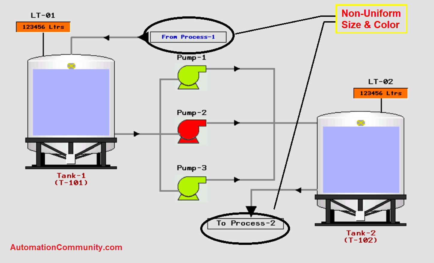
From and To Naming Conventions
A process receives its input from somewhere and gives its output somewhere. This from and to process must be highlighted properly with some special indication. This is because it helps the operator in linking the process accurately.
The indication must be different from other labels, which will immediately divert the notice of the operator to that point.
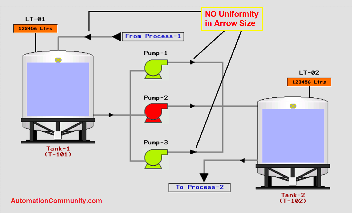
Arrow indication
There are generally two types of arrows in a screen; the first is the from and to arrow, and the second is the process flow arrow in lines. The from and to arrows must be indicated by a different color or size, which will differentiate them from other arrows.
The process flow arrows in the lines must be of the same size and color everywhere. It means that uniformity must be maintained. This ensures proper visibility of the process.
Different color representations for various elements
In the image, you can see that I have used 3 different colors – black, brown, and blue. Black color is used for automation instruments, brown color is used for static object tags which have not been used in automation IO’s, and blue color is used for process name objects.
Different colors while maintaining uniformity in it shows the operator which elements are available in overall automation and process for its understanding.
Uniform Text Size
Texts, wherever used on screens, should be of uniform size. Whether the text is for static objects or dynamic objects, text size should be equal throughout the whole project.
Static Symbols
HMI looks good when you represent any object by some actual thing. Suppose you have a tank in the process, then it will look best to insert a tank in the screen; but not any dynamic one. The symbol used must be of proper color matching with the screen, and not look cumbersome.
Also, if a tank is used, then try to show its actual level by dynamic color properties (with moving animation). This will help the operator in viewing the actual level more easily.
Dynamic Symbols
Objects like pumps and valves, which have IOs in the PLC, must be represented by proper color animation. If you give any random color, then it will totally confuse the operator.
The standard color is – red for off, green for on, and yellow for the trip.
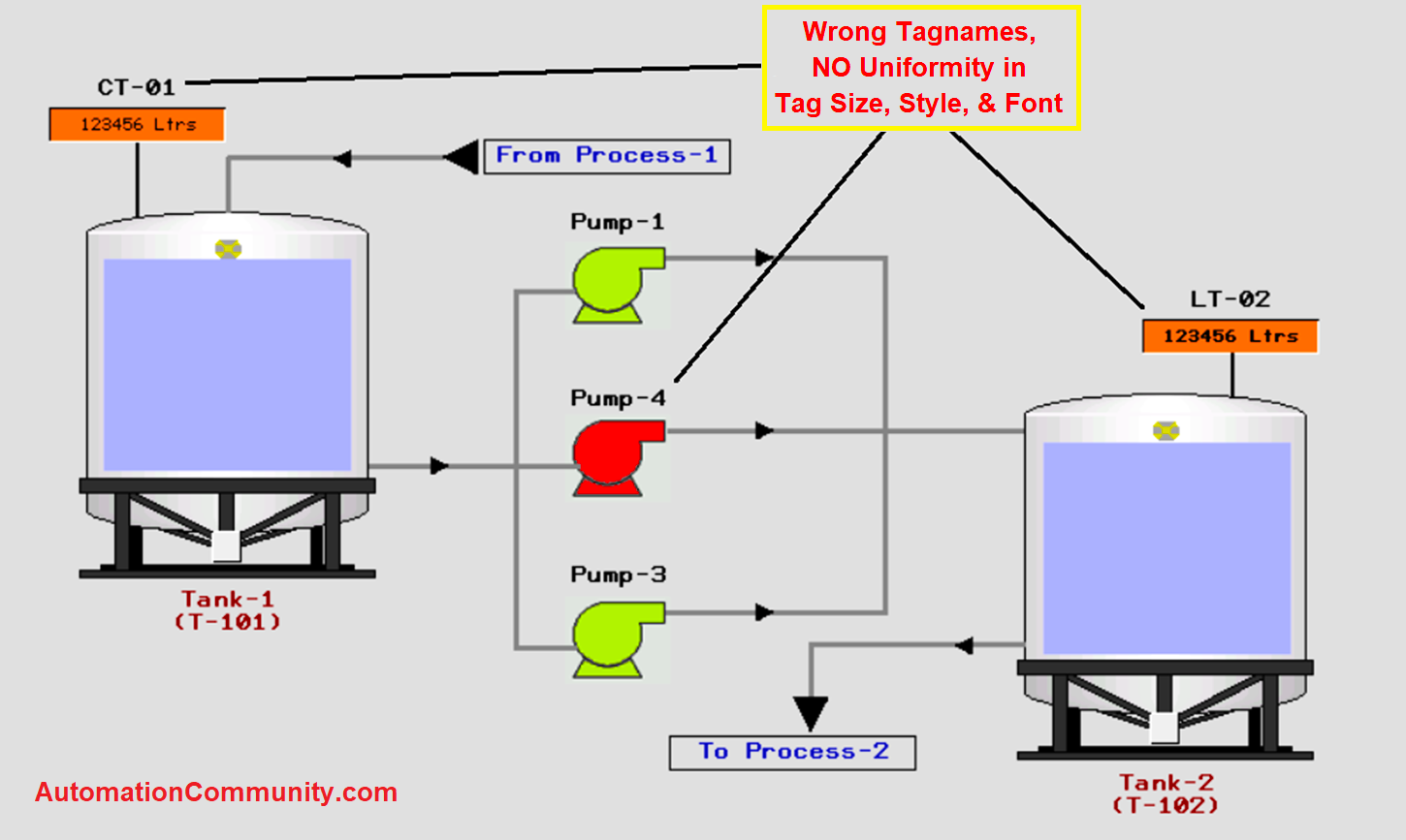
Now, as we got to know some general rules, let us compare the previous screen by some abnormal methods, which will help you in designing the screens properly.
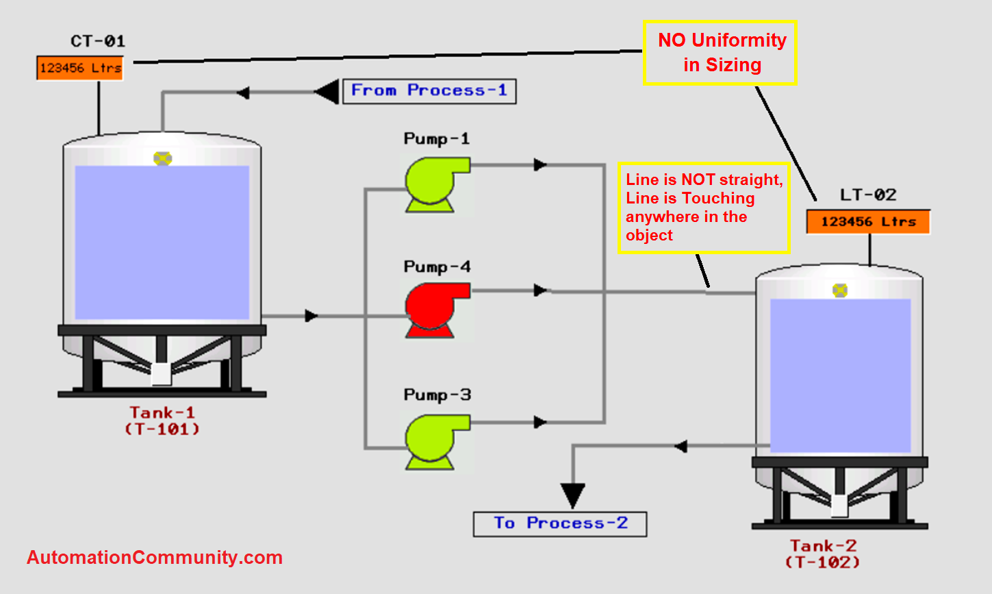
These are some general mistakes that can happen during development. The whole objective is to give correct naming, sizing, coloring, and representation of the symbols.
This can help in the proper operation and viewing of the plant.
By having all of the information now, you will know that the project you develop will maximize the control system capabilities and still work within the constraints of its limitations.
Again, this hard work upfront will make your project easier and lead to a much better chance of success and of course, profits. In this way, we saw how to design an HMI screen efficiently.
Read Next: